
Updated 2 pm 10 January 2022 with comments on effect of Omicron variant on risk of hospitalisation.
Key messages
We can predict with confidence from yesterday's infections hospital numbers in 12-days time.
Even if the epidemic estimates provided here are wrong, they are useful in alerting us to what needs close attention.
The switch underway to mainly Omicron variant will soon drive hospital numbers down (by around a factor of half in relative risk) but evidence for this change occurring is currently weak and preliminary.
This post is about a simple useful way to use daily new COVID-19 infection numbers to predict future needs for hospitalisation.
It's based on looking at what happened in the Sydney and Melbourne Coronavirus outbreaks that started in late 2021. It makes no active allowance for differences between Delta and Omicron virulence until they show up in epidemic hospitalisation records, but because of this can detect the effects of lower Omicron virulence when it emerges.
It might yield useful information about what lies ahead for those cities in coming weeks.
It's based entirely on existing epidemic data and it's probably accurate for prediction two weeks ahead, and maybe even longer going forward. This existing data in 2021 reflect mainly the behaviour of Delta variant of coronavirus.
It uses the observed strong correlation between current daily state coronavirus infection numbers and hospitalisation levels 13 days later.
Similar methods have been described elsewhere which use total active cases to predict outcomes but the Pundit has not yet checked through how to calculate and validate active cases but does know how to calculate daily cases accurately.
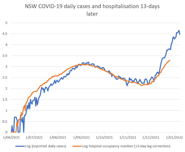
First let's look at the pattern in the New South Wales coronavirus outbreak starting late 2021:
Realistic plausible mechanisms are needed for successful prediction.
The value for the daily cases is plotted (blue curve) against the actual day in which those tests were reported, whereas the value for hospital numbers (orange curve) is that occurring 13 days later. This would be the time at which any infected people in those daily cases who went to hospital will very likely be preparing to leave hospital, hopefully recovered. This is a plausible simplified mechanism justifying the usefulness of the calculations that follow.
In any case this 13-day lag correction makes the blue and orange curves overlap closely. So the extent to which daily cases predicts hospital occupation 13 days later can be assessed visually. It is fairly good overlap although there is a small gap between the curves both early on and at the end of the period.
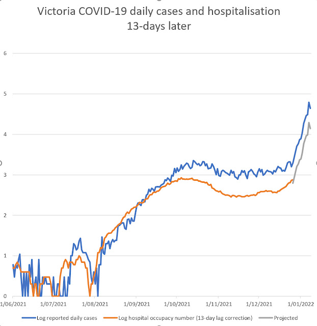
Here is a similar curve for the Victorian COVID-19 outbreak that occurred at the similar time of the year:
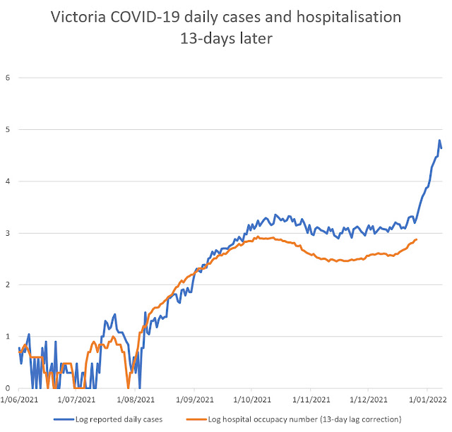
A similar pattern is seen to that in New South Wales, even though the timing of the Victorian cases differs somewhat from the New South Wales case curve.
One feature that the Pundit noticed is that the orange curves cross the blue curves at a similar date in both epidemics. The Victorian daily case numbers correlate strongly with hospitalisation numbers over the time interval examined. (Previous posts that this blog have documented more extensive correlation over the full period of the Victorian Covid 19 epidemic.)
Put together, these correlations suggest that daily case numbers provide a very good prediction of hospital bed occupation by COVID patients, but not perfectly, because there is a need for a small correction if the curves are to overlap even more closely.
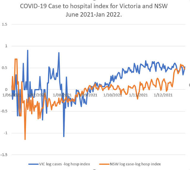
Case to hospital ratio index allows more precise prediction by allowing correction to imperfect correlations.
From these log plots the difference between these two curve (that the Pundit calls case to hospital ratio index) can be calculated easily for each day and this shows in effect what correction is needed to make daily cases an even more accurate predictor of future hospitalisation:
 |
| Updated 10 Jan 2021 11 AM |
The index is calculated as the difference between logarithm of daily cases and logarithm of hospital numbers adjusted 13 days for lag.
As it is a difference of logarithms, it is related to a ratio of new cases per hospital bed numbers.
A larger value of the case to hospital ratio index means less severe disease impact in the epidemic and a lower value means greater hospital load. The trajectory of the index shows periods late in the epidemic where the index was constant. This means it can be is the applied as a correction to give accurate prediction. Ignoring noise when case numbers below, there is a consistent rise in the index over time most likely detecting the effect of vaccination and booster programs. The New South Wales index rises from a lower value indicating that at the start of the Sydney outbreak disease severity was very bad.
At at the end of this period both states have the same index value (0.50). This means that hospital numbers were daily cases 13 days earlier divided by 3.16. (That is a property of logarithms that can be used for calculating purposes.)
It seems fair to suppose (that for projecting trends into the future) that this disease severity index will remain approximately constant in the near future, given that it has had a steady value for several months in the existing records in November and December (see graph above).
Using this division process of cases/3.16 (or its equivalent subtraction of logarithm values) we can project forward expected hospitalisation levels over the next 2 weeks by adding the projection as a different colour line as follows:
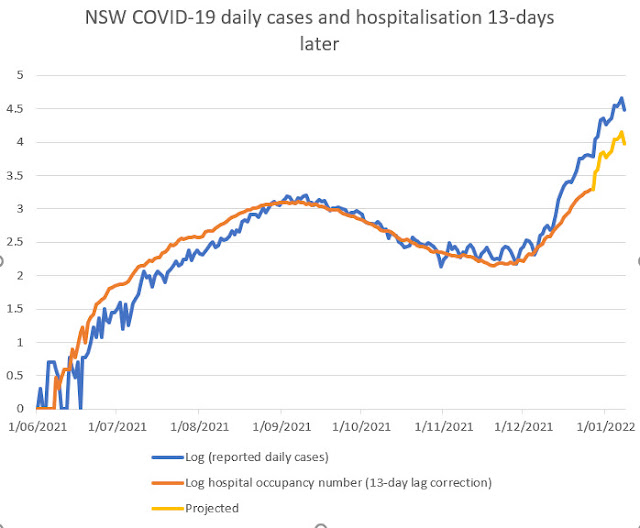
Such a situation would severely stress the medical systems of both states.
It is based on existing detected cases and on known index patterns. largely with Delta variant of SARS- virus, and assumption of constant Case to hospital ratio index over the next two weeks.
The estimate may exceed the level of hospitalisation patient numbers (3000 to 6000 ?) that the New South Wales Government seems to be anticipating.
These current projections could be wrong but the need for revision should show up over the next week
As mentioned, there is no presumption in this method in making these hospital number future predictions about explicitly allowing any lower virulence of the Omicron variant until it gets reflected in actual hospitalisation records. When this low virulence flows through to hospital entries (with a lag of about 5 days) it will make the slope of the actual hospitalisations line diverge from the prediction lines.
These bad severity signals may be overestimates, as with the entry of Omicron variant infections the Case to hospital ratio index may continue to increase over the next weeks, but fortunately this correction can be easily picked up if we get accurate medical data over the next week. We expect the Omicron variant to exhibit a significantly higher Case to hospitalisation index .
A recent UK Government report indicates that this change because of lower severity of Omega compared to the previous Delta SARS-2 can be substantial:
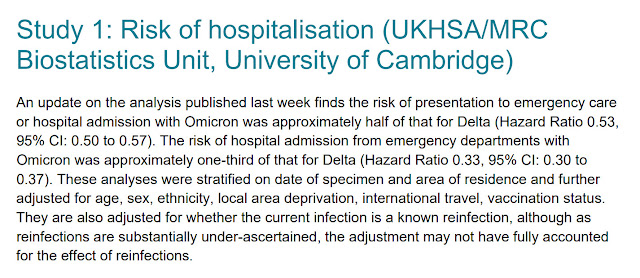
Even if new daily case numbers are inaccurate, any undershoot from predicted hospital numbers shown on these graphs will signal welcome softening in severity of disease that is expected with the Omicron variant, and which may already be showing up in the NSW epidemic graphs as a jump already detected in the Case to hospital ratio index.
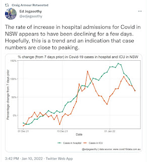
A very recent Tweet probably describes the same welcome late improvement in epidemic mildness mentioned here:
Hopefully we may see similar improvements in Victoria.
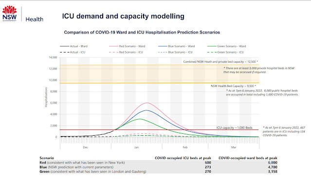
The projections made in this post can be used as a benchmark for revealing lower Omicron variant virulence over the coming weeks. NSW Government modelling projects lower hospital numbers based on factoring in lower severe health outcomes with Omicron variant infections, and give more reassuring numbers:
Slide at https://www.health.nsw.gov.au/Infectious/covid-19/Documents/icu-predictions.pdf
In short, even if these projections are wrong, they are useful alerts on what needs close attention.
Expected Vic Hospitalisation numbers compared with actual as they eventuate:
Report 9/1/22 (Announced next day). expected 854. Observed 818 (update after first posting)
Report 10/1/22 expected 1178 Observed 946 (update after first posting)
Report 11/1/22 expected 1609 Observed 953 (update after first posting)
Remember failed over-expectation is good news.
This is starting to look interesting-- with lower hospitalisation than expected
Lets continue the prediction
Report 12/1/22 expected 1853 Observed 976 (update after first posting)
Report 13/1/22 expected 2352 Observed 953 (update after first posting)
Report 15/1/22 expected 2448
14/1/22 decision. Actual hospital outcomes for Victoria are better than prediction. Time to recalibrate. See outcome in later post.
No comments:
Post a Comment