
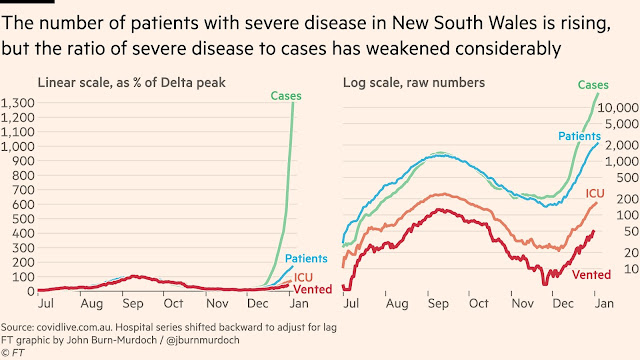
The previous post noted encouraging signs of less disease severity in the COVID-19 outbreak in Sydney compared to the previous Delta variant wave.
These came from looking at the progression of hospital and ICU patient numbers over time. Late December 2021 a smaller and smaller fraction of hospitalised patients went to the ICU.
But there is more to this story. We want to know is the epidemic slowing down, and suspect that total infection daily numbers may give misleading false signals of epidemic slowdown, as the testing system is overloaded. But hospital patient records are likely much more reliable.
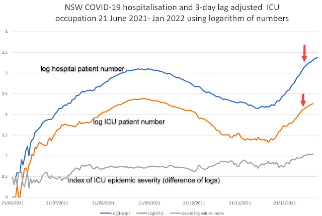
This is what you get when you plot logarithms of hospital numbers against time:
 |
| Updated 13 Jan 2022 |
Both the hospital total patient numbers and intensive care unit (ICU) patient numbers started show slowed rate of growth very late in December.
This is a sign we may be nearing a peak in hospital and ICU demand because real daily infection numbers are decelerating.
This is a hopeful signal.
An Index of epidemic severity based on relative ICU demand - log hospitalisation -log ICU numbers.
It's also interesting to look at the gap between these curves, which is an index of how likely it is hospitalised patients will also suffering from very severe disease that needs ICU care. High values of the index are good news.
This index increased in August 2021 as coronavirus vaccines were rolled out, in November 2021 as vaccine boosters were rolled out, and in January 2022 as the Omicron SARS-2 variant virus started to dominate.
The Pundit finds that fascinating and welcome news, better than stock index changes.
Update 22 January.
Confirmation and calibration of these risk estimates can be found in from NSW Health weekly COVID-19 surveillance reports.
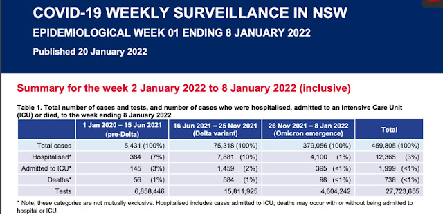
Hospitalisation risk (10 percent of infections) in the Delta wave was ten-fold greater than the 1 percent for infected people in the Omicron wave.
The trends noted before for ICU entry risks are confirmed from ratios of ICU entries/total hospital entries.
For the Delta wave ICU admissions were ~18 percent of hospital entries, for the Omicron wave they were ~ 10 percent of total hospital admissions.
See also next post:
Update 1110 am
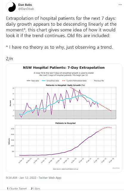
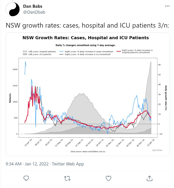
Other hopeful views of this on Twitter

The Pundit is feeling peakish too.
13 January update.
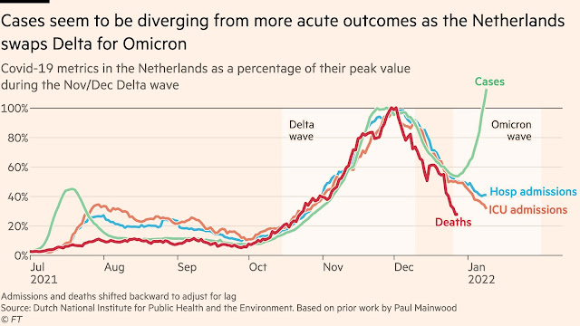
The Netherlands are a good model for how Australian cities will fare during passage of the Omicron waves.
John Burn-Murdoch has been doing relevant similar graphical analysis at the Financial Times, laying out the events that allow us to assess the epidemiological impact of an Omicron wave.

No comments:
Post a Comment