
Near The Peak?
The epidemic Omicron wave in the sister city, Melbourne, started a little later than Sydney's wave, so signals of lower epidemic severity were slower to emerge.
There are now some hopeful signs that lower disease severity is showing up in the Melbourne outbreak.
This shift in severity is expected from the behaviour of the Omicron wave in several other countries but it's nice to see it in your home town.
First a graph from Matt Hopcraft ( @matt_hopcraft on Twitter) showing daily cases in Victoria ( where Melbourne is located), including the late year -New Year Omicron wave.
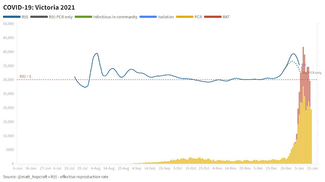
The major new daily infection peak at the end of the year is mostly Omicron variant.
Here is a graph showing concurrent epidemic hospitalisation patterns.
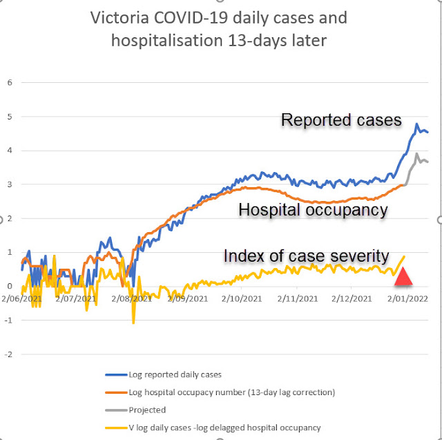
The blue curve is reported diagnosed coronavirus infections each day. The orange curve is the corresponding number of hospitalised patients (adjusted for the 13-day lag between symptoms and departure from hospital for severely ill patients).
Both curves are plotted on a log scale. There is an upturn in both blue and orange curves at the start of 2022 -- at the time of the wave of infection with Omicron virus variant.
Also plotted on the graph is the gap between the two curves just mentioned (i.e the difference log (cases) -log (hospitalisation). This is related to the case/hospital number ratio and is a good index of disease severity, with higher values meaning relatively less severe disease. This index is based on reliable numbers. December 2021 case numbers and early January hospital numbers
Severity index jumps to less harm signal at the end of the year.
The index takes an upturn early January, (see red arrow on graphic), meaning that if you get infected chances of needing hospital care are lower with this latest wave than the preceding Delta wave. The jump is about the size expected from behaviour of the Omicron variant. Medical scientist expect this jump.
Assuming the index remains constant in the week ahead, we can predict future expected hospitalisation. Hospital numbers may well peak near 5000 if daily cases have now reached their highest number, based on this projected trajectory shown in grey on the graph.
If the index of severity improves further, future hospital numbers will be lower still. Let's hope that happens. A few more days should enable better predictions.
Most importantly, let's hope both epidemic infection transmission halts very soon, as huge numbers of infections swamp out any benefits from any lower intrinsic severity of the Omicron virus. The case-curve shown by Matt gives us some hope of that.
No comments:
Post a Comment